
Painted cabinetry covers more of a kitchen than almost anything else in it. The colour runs along several walls, wraps around the island and meets the worktop, the floor, the handles and the tap, and it is seen in morning light, in the evening and under lamps. Choosing it well has less to do with following a set palette and more to do with the room it will live in.
Painted in frame cabinetry is the signature of our bespoke kitchens. Sylvan Design makes in frame kitchens in its workshop near Horsham, West Sussex, painted in named heritage colours, with all finishing completed in the workshop before installation. Because of that, your colours are settled before your cabinetry is finished, so it pays to choose them with care and to test them properly in your own home.
This guide covers the light in your room, how much of it the colour will cover, pairing the cabinetry with an island colour, hardware, worktops, the rest of the room and how to sample. Throughout, it uses the real pairings from our kitchens, named exactly as they were specified, as worked examples. They show what other households chose for their own rooms rather than what will suit yours, and every colour should be sampled in the room where it will be used.
Start With the Light in the Room
The same paint can look quite different from one room to the next, and the main reason is light. Before looking at colour cards, note which way the kitchen faces, how large the windows are and when you use the room most. A kitchen used mainly for breakfast and one used mainly for evening meals are seen in very different light.
In Britain, north facing rooms receive cooler, more even light through the day, and colours tend to read cooler and a little darker in them. South facing rooms receive warmer, stronger light for much of the day, which can make a pale colour appear lighter than it does on the card. East facing rooms are brightest in the morning and cooler later on, while west facing rooms are softer in the morning and warmest in the evening. None of this rules a colour in or out, but it explains why a colour admired in one house can look different in another.
Artificial light matters as much as daylight in a room that is used after dark. The colour of your bulbs, any lighting under the wall cupboards and the pendants over an island will all change how the paint appears in the evening. Many paint makers also publish a light reflectance value for each colour, a number from 0 for black to 100 for white, which is useful when comparing two close colours.
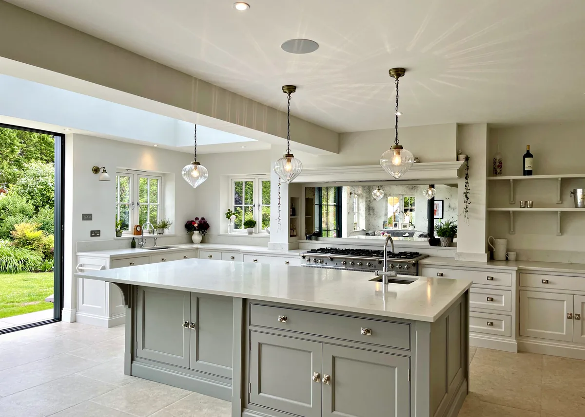
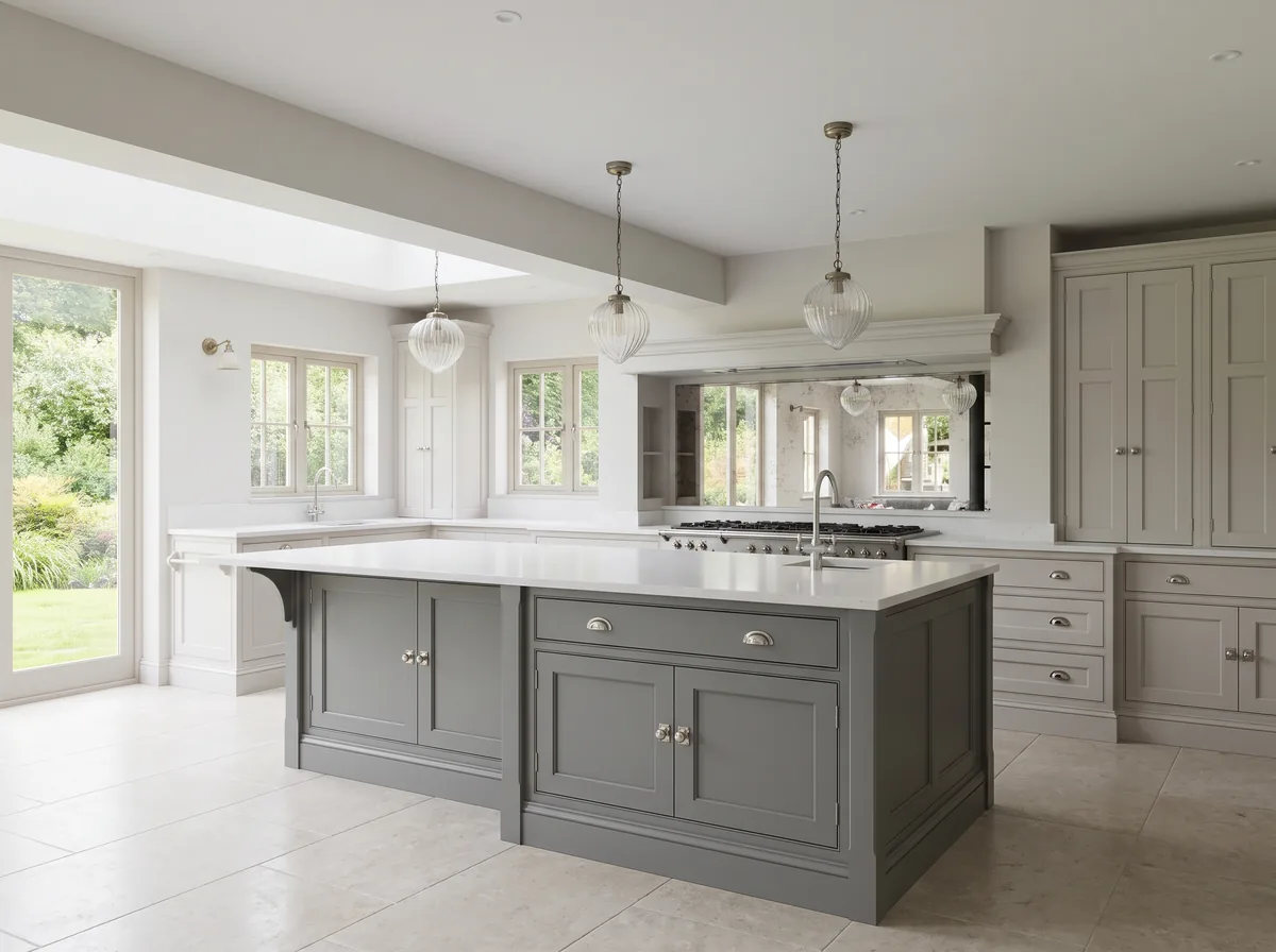
Some rooms are naturally bright. Wrens Hill, a light and airy kitchen that opens straight onto the garden, also has a mirrored splashback to bring in the light. In a darker room, it is worth sampling a few colours slightly lighter than your first choice and comparing them side by side.
Consider How Much of the Room the Colour Will Cover
A colour that seems quiet on a small card can read much more strongly across a full run of cabinetry. Tall larders, a dresser and cabinetry taken up to the ceiling become large blocks of colour, while a single run of base cupboards with open shelving above shows far less. Before choosing, picture the colour at the scale it will actually be used.
This is one reason many painted kitchens use two colours. A lighter colour on the cabinetry that lines the walls keeps the largest areas of the room light, and a second colour on the island or on a single piece of furniture gives a smaller area of contrast. The balance between the two is a question of proportion as much as of colour.
Walls and ceilings are part of the picture too. If the walls around the cabinetry are painted, decide whether they should sit close in tone to the cabinetry or contrast with it, and sample the wall colour alongside the cabinetry colour rather than on its own. Open shelving shows the wall behind it, so the wall colour will be seen between the shelves as well as around the cabinetry.
Pairing the Cabinetry With an Island Colour
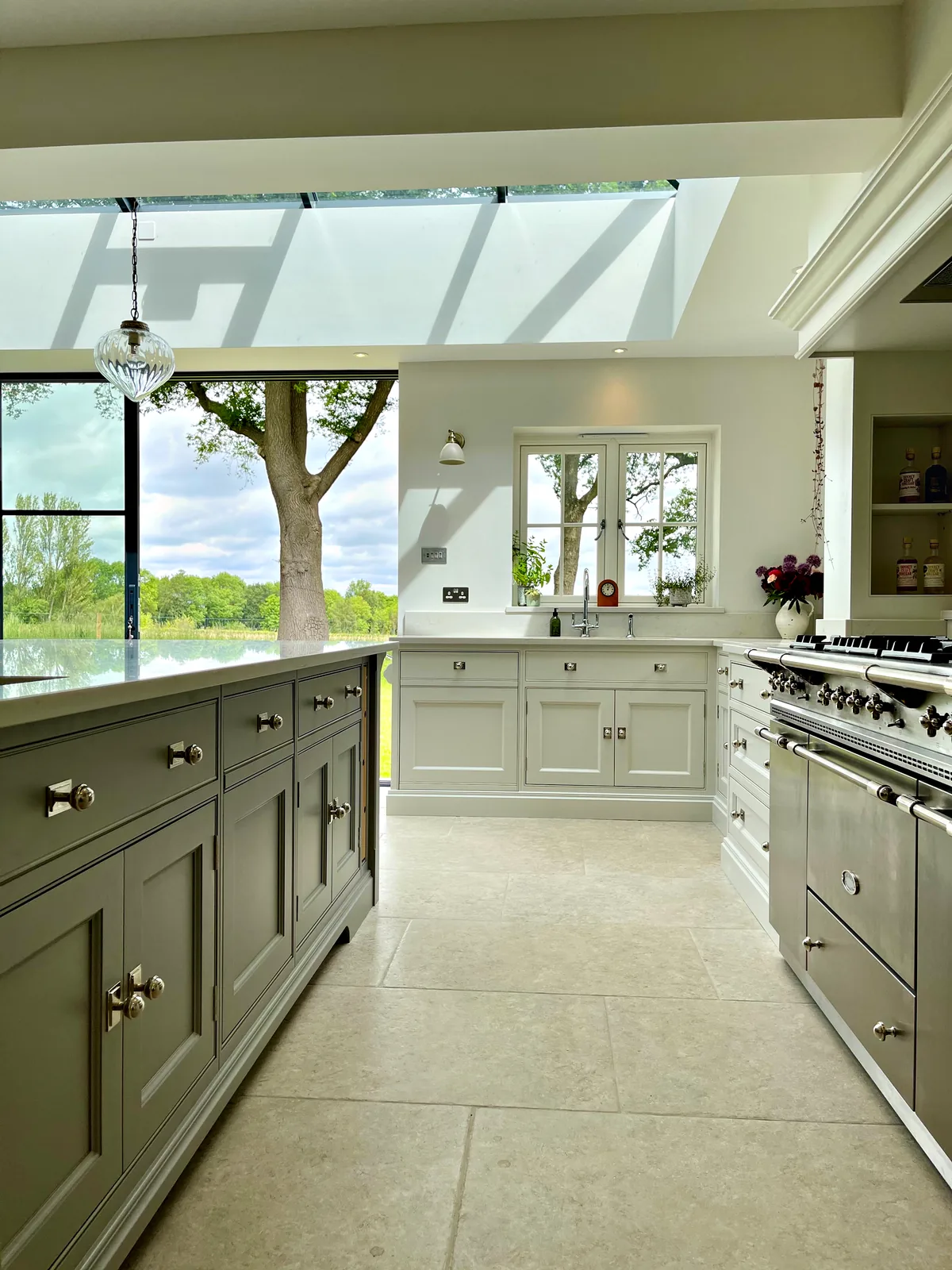
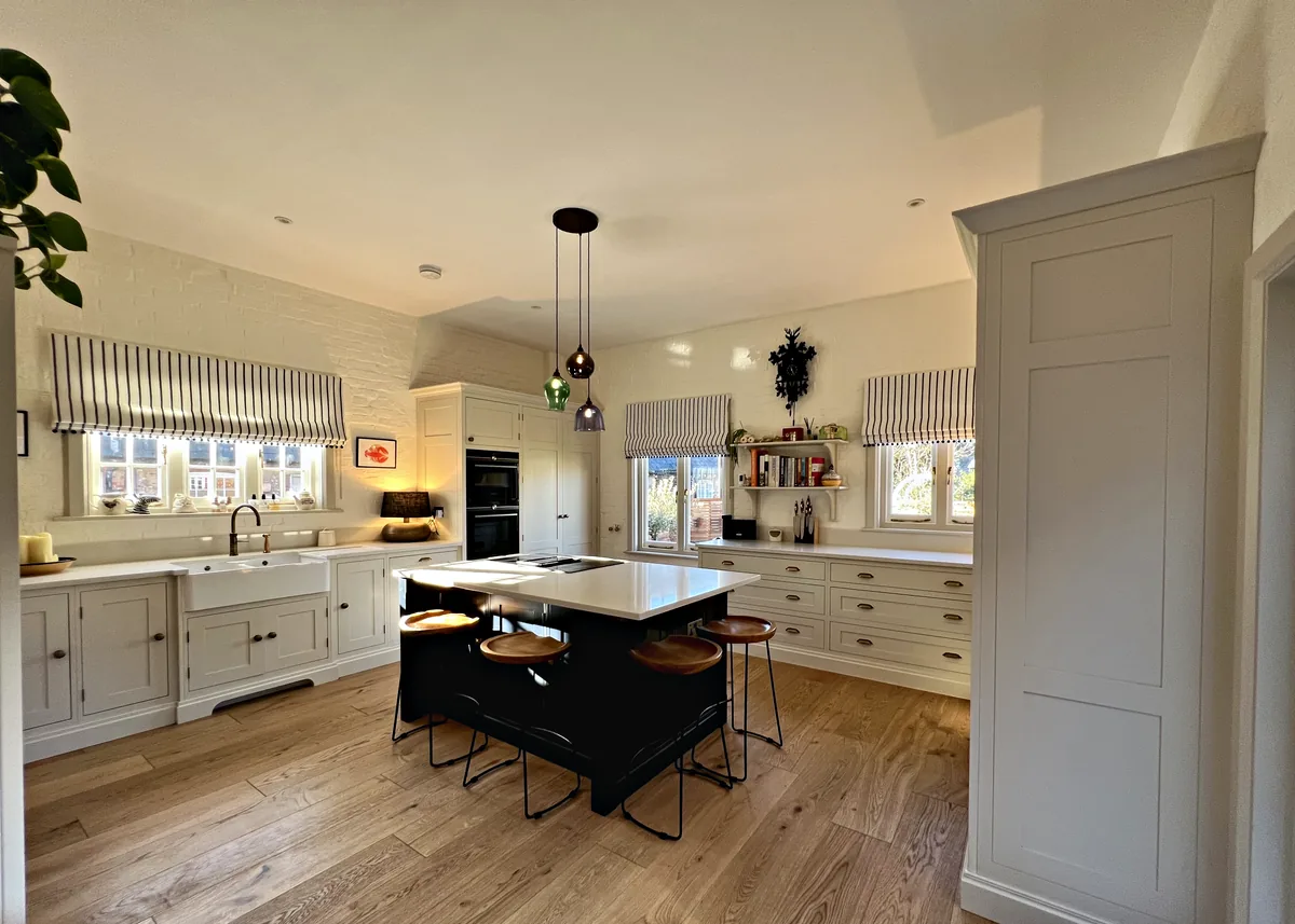
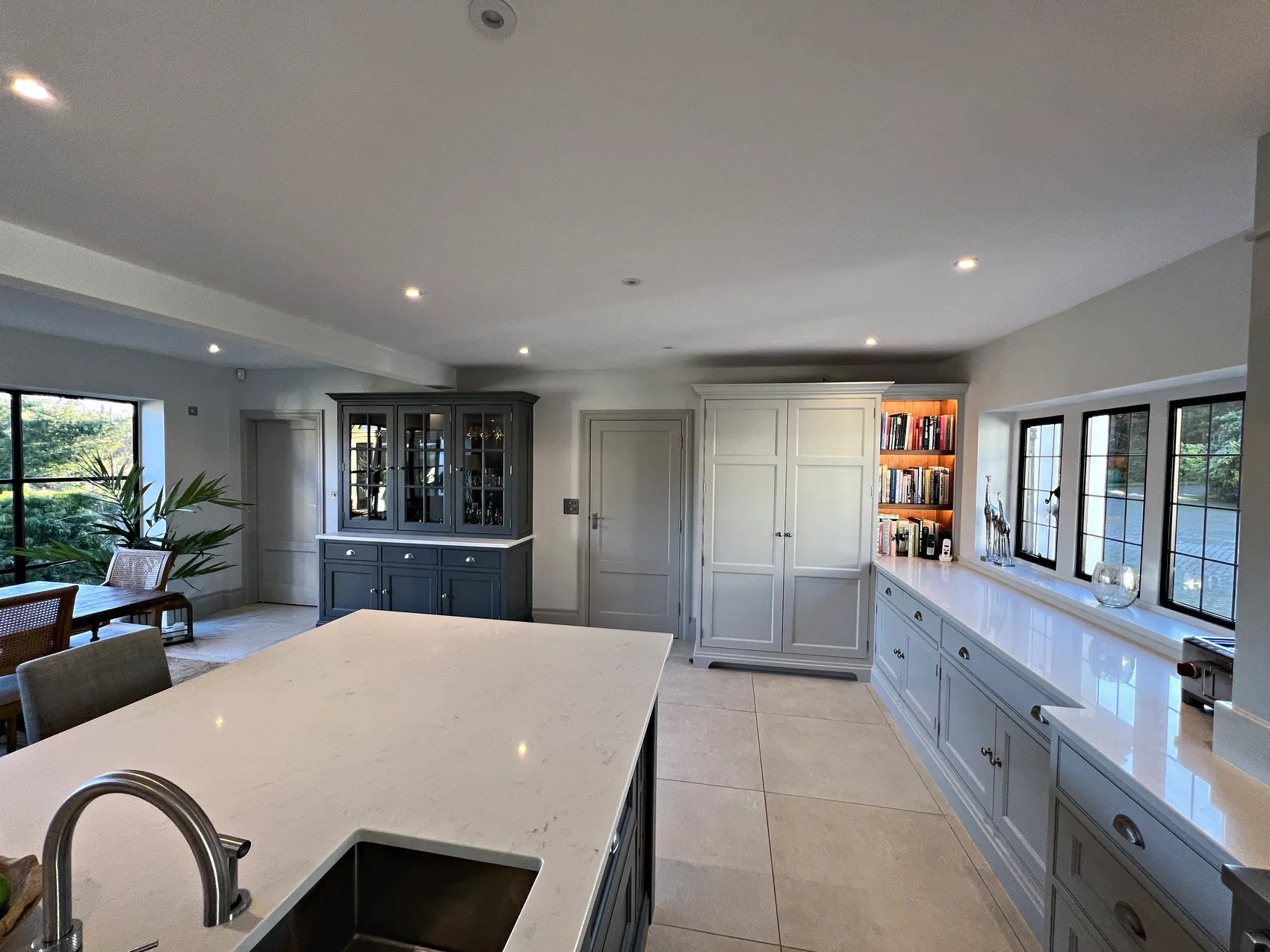
In each of the five kitchens in this guide that pair a cabinetry colour with a different island colour, the island is the darker of the two. The island stands on its own in the middle of the room, so the darker colour is confined to one piece of furniture while the cabinetry around the walls stays lighter. What varies is how far apart the two colours are.
Some pairings are close in tone. At Wrens Hill, cabinetry painted in Farrow & Ball Ammonite is paired with a large island in Farrow & Ball Worsted, a pale grey with a mid grey, and Bianco Carrara quartz worktops tie the room together. The step between the two colours is a gentle one.
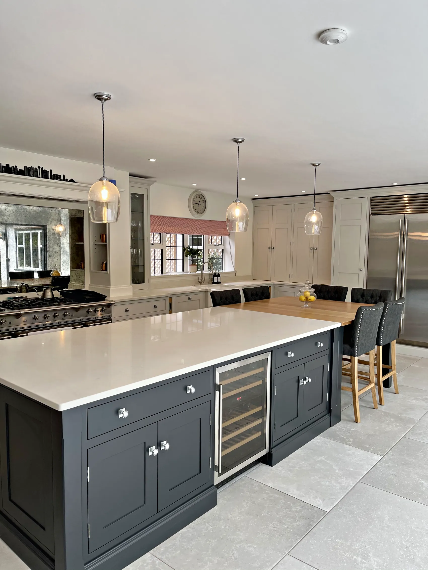
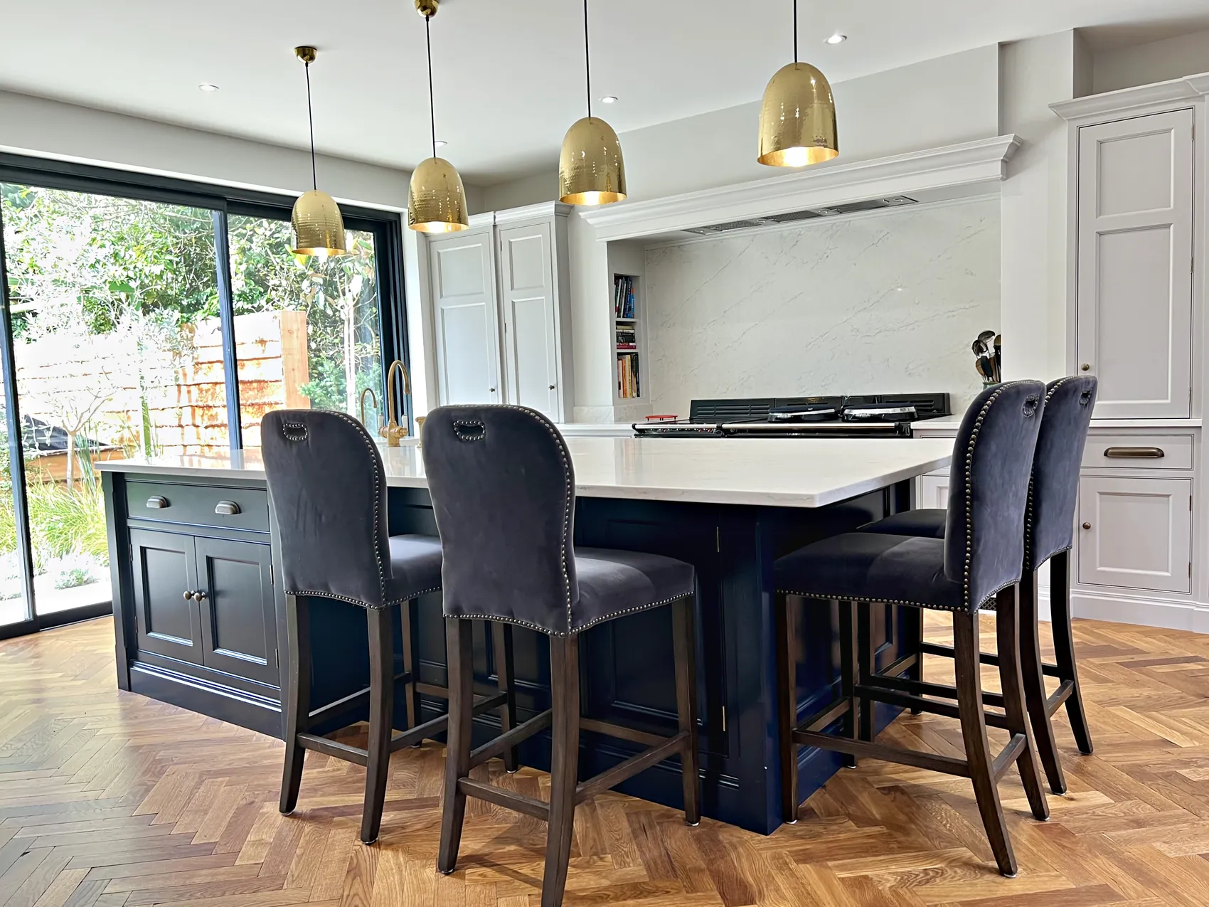
Others are a clear contrast between a light colour and a dark one. At Malbrook, cabinetry in Farrow & Ball All White is paired with an island in Farrow & Ball Hague Blue. At Munstead Plat, cabinetry painted in Farrow & Ball Pavilion Grey is paired with an island in Farrow & Ball Off Black. At Old Hospital House, cabinetry in Farrow & Ball Shaded White sits with a central island in Paint & Paper Library Plimsoll.
Pairings do not have to come from one paint maker. Meadowcroft pairs cabinetry in Dulux Heritage Pebble Grey with an island in Mylands Bond Street, and Old Hospital House pairs a Farrow & Ball colour with one from Paint & Paper Library. What matters is how the two colours sit together in your room, and only sampling them there will show you that.
Colour Pairings From Our Kitchens
Each pairing below comes from a kitchen we have made, with the cabinetry colour and the island colour named exactly as specified. Choose a kitchen to see its pair on the drawing.
Choose a Kitchen
Wrens Hill
Ammonite With Worsted
- Cabinetry
- Ammonite Farrow & Ball
- Island
- Worsted Farrow & Ball
Pale grey cabinetry and a mid grey island sit under Bianco Carrara quartz worktops.
See the Wrens Hill KitchenMeadowcroft
Pebble Grey With Bond Street
- Cabinetry
- Pebble Grey Dulux Heritage
- Island
- Bond Street Mylands
Light grey cabinetry is paired with a dark island and handles in Satin Antique Brass.
See the Meadowcroft KitchenMunstead Plat
Pavilion Grey With Off Black
- Cabinetry
- Pavilion Grey Farrow & Ball
- Island
- Off Black Farrow & Ball
Light grey cabinetry is paired with a near black island and knobs in Satin Chrome.
See the Munstead Plat KitchenOld Hospital House
Shaded White With Plimsoll
- Cabinetry
- Shaded White Farrow & Ball
- Island
- Plimsoll Paint & Paper Library
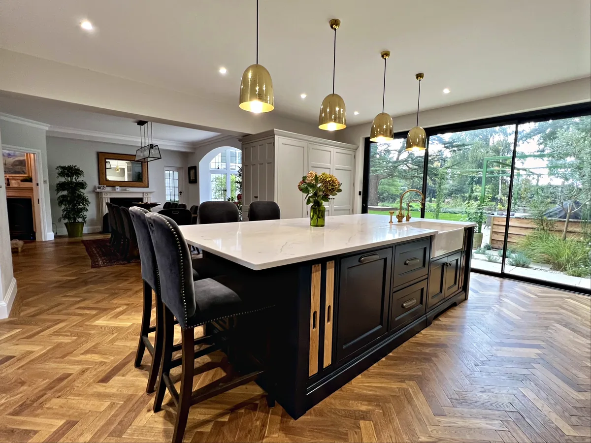
Pale neutral cabinetry is paired with a dark central island and antique brass cup handles.
See the Old Hospital House KitchenMalbrook
All White With Hague Blue
- Cabinetry
- All White Farrow & Ball
- Island
- Hague Blue Farrow & Ball
White cabinetry in our Lancaster range is paired with a dark blue island and marbled quartz tops.
See the Malbrook KitchenColours on screen are only a guide. Always sample paint in your own room before deciding.
Using Two Colours Without an Island
An island is not the only place for a second colour. At Downend, a kitchen made for entertaining, the cabinetry is painted in two Farrow & Ball colours, Downpipe and Pavilion Grey, offset with American black walnut interiors and Classic Quartz San Vincente work surfaces. Downpipe is a dark grey and Pavilion Grey a light grey, and the walnut inside the cabinets adds a third material that is seen whenever a door is opened.
A second colour can also mark out a separate piece of furniture, such as a dresser or a larder, or divide tall units from base units. If you are thinking along these lines, decide early which pieces take which colour, because the drawings and the finishing in our workshop depend on it.
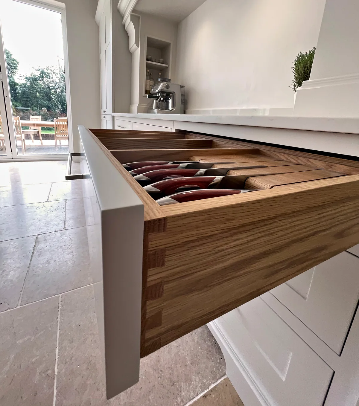
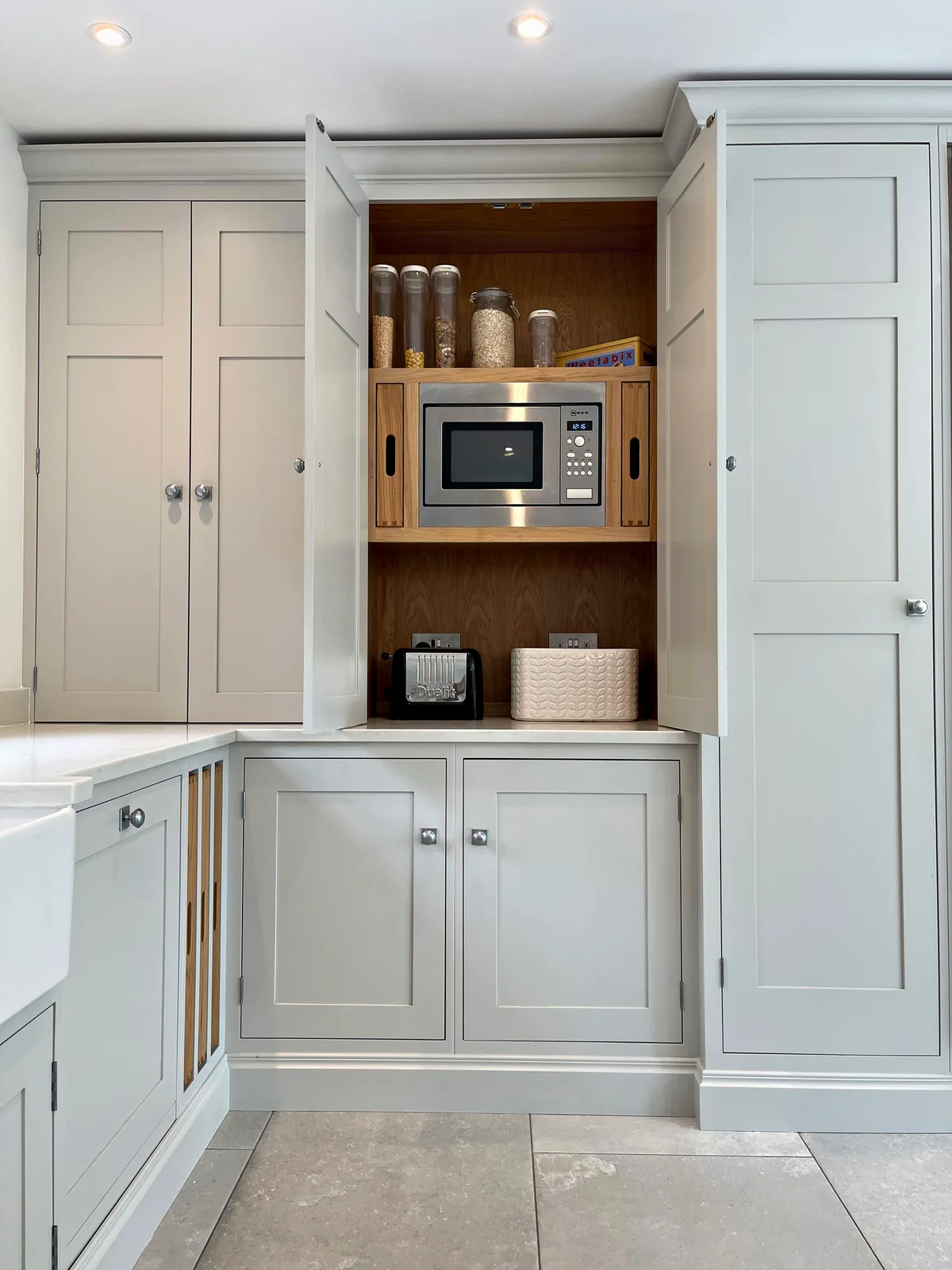
Cabinet interiors are part of the scheme as well. An interior painted to match the doors keeps the cabinetry consistent inside and out, while a timber interior gives a contrast each time a door or drawer is opened. Either way, look at the interior finish alongside your paint samples before you decide.
Choosing Hardware Finishes
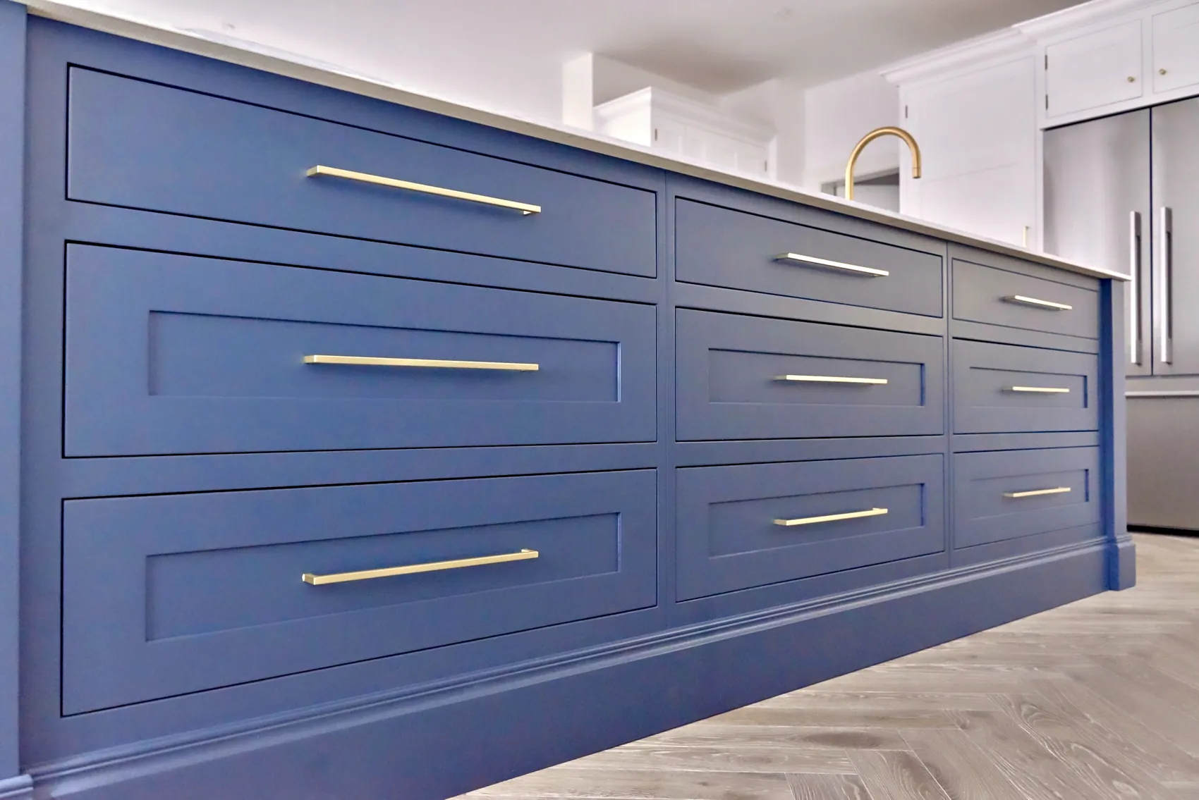
Handles, knobs and hinges are small, but they appear on every door and drawer, so their finish works with the paint colour across the whole room. A useful approach is to choose one metal finish and carry it through the handles, the tap and any other metal in view, such as the trim on a range cooker or the front of a fridge.
Our kitchens show how this works. At Old Hospital House, antique brass cup handles are matched by a Quooker tap in brass. At Meadowcroft, the handles are Armac Martin Withenshaw in Satin Antique Brass. At Munstead Plat, Armac Martin Queslett knobs in Satin Chrome complement the cabinetry and tie in with the Sub Zero fridge freezer and the LaCanche range cooker.
Think about the type of handle as well as its finish. Cup handles are comfortable on drawers that are opened many times a day, knobs suit smaller doors, and a long run of drawers looks orderly when every handle sits at the same height. Satin, antique and polished finishes reflect light differently, so hold a sample handle against your paint boards in the room before deciding.
Bringing the Worktop Into the Scheme
The worktop sits between the cabinetry and the island and covers a large horizontal area, so it is part of the colour scheme rather than a separate decision. Choose it early, and look at your paint samples beside a worktop sample in the room, in the same light.
Quartz appears in several of our kitchens, from Classic Quartz Olympia at Meadowcroft to Classic Quartz San Vincente at both Downend and Birds Hill. At Birds Hill, the San Vincente worktops work with cabinetry painted in a warm pale grey, while at Downend the same worktop sits with Downpipe and Pavilion Grey, which shows that one worktop can sit with quite different painted schemes.
Splashbacks are part of the scheme too. At Malbrook, hand silvered mirror splashbacks complement marbled quartz tops. A mirror reflects whatever stands opposite it, so think about what it will show, whether that is a window, the island or the far side of the room.
The finish of the worktop matters as well. A polished surface reflects more light than a honed or matt one, which can change how the cabinetry colours beside it appear, so compare samples in the finish you intend to use.
Floors, Walls and the Rooms Around the Kitchen
The floor is one of the largest surfaces in any kitchen, and it sits directly below the cabinetry. Bring a sample of the floor, or a photograph of it taken in daylight, when you choose colours. At Old Hospital House, the Farrow & Ball Shaded White cabinetry and the Paint & Paper Library Plimsoll island complement both the antique brass hardware and the oak floors.
In an open plan room, the kitchen colours are seen alongside dining and living furniture, so look at your samples from the far end of the room as well as from the sink. Fabrics, a dining table and any timber in the room will all sit beside the paint.
If doors lead off the kitchen to a utility room, a boot room or a larder, decide whether the colour continues through or changes, and sample the colours for both rooms together. The same applies to a dresser or fitted furniture in an adjoining room that will be seen from the kitchen.
How to Sample Paint Colours Properly
Every colour should be sampled in the room where it will be used, however familiar it seems. Paint two coats onto large sheets of card or board, at least A4 and preferably larger, and leave a white border around each one, so the existing wall colour does not affect what you see.
Place the cabinetry sample upright against the wall where the cabinetry will stand, and the island sample at the height and position of the island. Look at them in the morning, in the middle of the day and in the evening with the lights on, and leave them in place for several days rather than deciding in a single visit.
Look at the samples together with everything they will sit beside: the worktop, the floor, a sample handle and the tap finish. Sheen makes a difference too, so where you can, sample the colour in a finish close to the one your cabinetry will have. Colours on a screen or a printed card are only a starting point.
- Two coats on a large board, with a white border
- The cabinetry sample upright, where the cabinetry will stand
- The island sample in the middle of the room
- Morning, midday and evening, with the lights on
- Beside the worktop, floor and handle samples
- Left in place for several days
Choosing Colours With Us
We talk about colour from the first consultation, when we learn how you will use the room and take initial measurements, and we give guidance on materials and finishes, including paint colours, during the design stage. Because all finishing is completed in our workshop before installation, the colours are agreed before your cabinetry is finished, and the final price is confirmed once materials, finishes and appliances are chosen.
Sylvan Design, a bespoke kitchen maker based in Horsham, West Sussex, has painted kitchens in colours from Farrow & Ball, Dulux Heritage, Mylands and Paint & Paper Library. If you have a colour in mind, bring it to the consultation, and we will look at it with you alongside your room, your worktop and your hardware.